Yuki KaQiLa
Design | Visual Identity
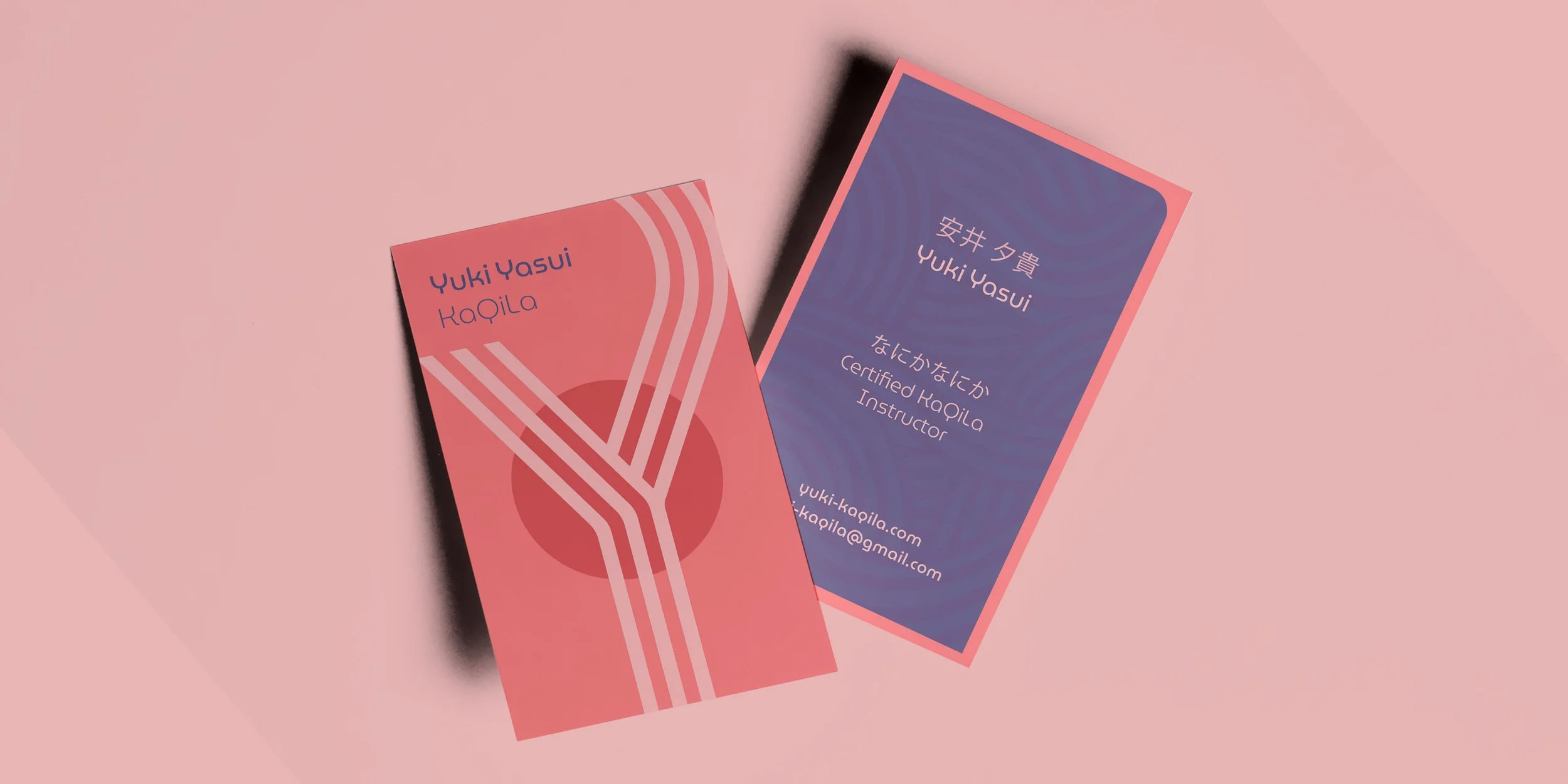
KaQiLa is a Japanese movement practice, based around flexibility and flow. I took the Y of the instructor’s name and gave it a flowing treatment, suggesting a figure with their hands raised, while the red circle of the Japanese flag is positioned at the centre of the Y’s ‘body’ to reflect KaQiLa’s focus on the core and ribcage. I also took inspiration from a traditional Japanese pattern called Nami, based around the flowing movement of waves in the sea — the pattern represents strength and resilience.